UX/UI Design
OBJECTIVE:
To create an ecommerce solution that meets the needs of both stakeholders and users.
Summary
From initial discussion to final implementation, creating a website involves many steps to ensure that both users and the stakeholders are satisfied with the outcome. The process begins by meeting the client to determine their goals and requirements and understanding and defining the scope of the project. It then moves through several phases of design, including: determining the needs of the website user (who may not ultimately be the stakeholder and who may have different needs and goals from the stakeholder); design thinking and developing potential solutions; determining which solution best meets the needs of the user; and creating a series of higher fidelity prototypes in an iterative process of design, testing and evaluation, and then reworking the design. This process should ultimately result in a website that not only meets the users needs and goals, but provides them with a positive user experience, while simultaneously meeting the goals of the stakeholders.
Requirements Extraction
Initial Requirements
The requirements of this website as stipulated are: Create an original eCommerce solution with shopping cart, using a CMS platform, to support direct-to-consumer sales of crystal and glass products, both as replacement for broken items and as home decor and art for display in the home.
Understanding the Business Requirements
Interior design and decorating for the home is an enormous market with a huge potential for growth. For home decor the target market is largely female between the ages of 30 to 65. At the lower end of the age range people are beginning to settle down into partnerships and starting to decorate their living spaces and to them their own. At the upper age range people are beginning the process of downsizing for retirement.
To meet the needs of these consumers it is important to understand the existing environment for a potential website for home decor products. There are currently a small collection of websites for crystal and glass products and these products can also be found on sites like Etsy and eBay and Amazon. While Amazon is clearly the leading contender and competing against this behemoth is problematic at best, analysis of the other websites reveals that many were created during the initial rush to sell online around the year 2000. Most do not seem to have been updated since then and look out of date. With the exception of a few sites, most are not even mobile responsive. Most of the existing sites still sell their products as raw supplies or replacement parts, completely ignoring potential new markets. These sites do not inspire confidence and with the short attention span of today’s consumers, a business can ill-afford to be unappealing to a potential consumer.
An opportunity exists for an experienced supplier to capture a significant share of the market.
Understanding User Requirements
While some projects are both work and domain complex and would require extensive interviews with users to determine their needs and work activity requirements, in this case the project is quite straight forward. Minimal contextual inquiry is necessary, as the standards for eCommerce platforms are generally well understood and established.
Determining the target user, however, is important and some user modeling is needed in order to determine optimal interface requirements.
Beyond the business requirements of the stakeholder, the users have their own set of needs and goals. Beyond the utilitarian need to simply find a product and purchase it, users are looking for more in their online and shopping experience and usability is part of the later picture.
Website users have become increasingly sophisticated; the expect more than just a usable system— they also expect it to be pleasing and engaging and they expect to be satisfied with their experience.1 Some of these expectations, for example, are to be entertained and informed, ideally both in combination.
Website Goals
Contextual inquiry and user needs extraction has identified certain goals for the website. When coupled with the business opportunities previously identified a clear set of user and business goals statements for the website can be produced, see Aside 1.
Website Goals
- An attractive, clean and modern website, with good product photography.
- A modern shopping cart interface which will stand out as a site that generates confidence to potential buyers.
- A modern, updated site will appeal to a younger potential market and an efficient checkout should generate a higher completion rate.
- The website should communicate to potential consumers quality and elegance without being stuffy and pompous to match the more casual lifestyles preferred today.
- The website should also be easy to navigate, with a few product categories and that does not overwhelm a visitor with too many choices.
- A fast and easy checkout and process with modern payment options will help to create a better experience for buyers by use of an efficient interface.
- To retain and encourage repeat visits a series of articles, both in written and video format on design ideas, DIY projects, and inspiration for using the products should be included, featured and promoted. Users have expressed the desire for a website that is more comprehensive than simply an online store.
- A fresh and diverse product line that appeals to several different markets can reduce the risks associated with a single market segment that can change or disappear entirely.
- Available customer service, fast shipping and good quality products at an affordable price should contribute to customer retention and a great user experience.
- The website should use modern user interface patterns and best practices to optimize the users experience.
Aside 1.
Needs extraction and the goals of the website.
Ideation, Design, and Prototyping
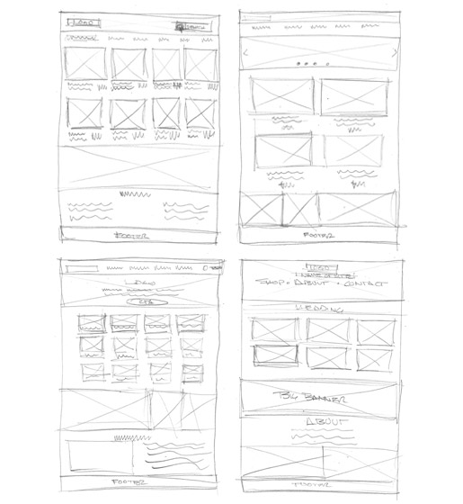
Figure 1.
Sketching. Quick sketches for ideation.
Inspiration
After the goals and requirements of the stakeholders and users are determined, the designing can begin. As the first step in the design process it is generally helpful to conduct a survey of eCommerce sites that exhibit outstanding and creative ideas and implement these ideas effectively. In other words, find inspiration.
Sketching and Ideation
It is often temping at this stage to jump right in and start building the prototype but it is generally best to slow down and get in the mindset of what is referred to as Design Thinking. This can be thought of as a process for inspiring design innovation and is often glossed over as it is an unknown and unspecified process, but is often critical to the start of the design process. Many well-known UX firms employ this technique and it is beneficial to creating a successful end product. Sometimes modeling the project in its ecological context or in the phenomenological or emotional context. Mental models and storyboards are often created for complex projects. This simple project began with with a number of quick pencil sketches on paper, blocking out the major areas and components to get a rough idea of the overall layout. The idea here is simply to produce many ideas without the constriction of critique, see Figure 1. From these many ideas we can then begin to refine and hone in on a layout that would best meet all the goals statements previously outlined.
Style Guide
A style guide was then created. Careful attention was given to choice of colors, typography, voice, and imagery, including the logo. These are all important considerations and greatly determine how a project is received., see Figure 2.
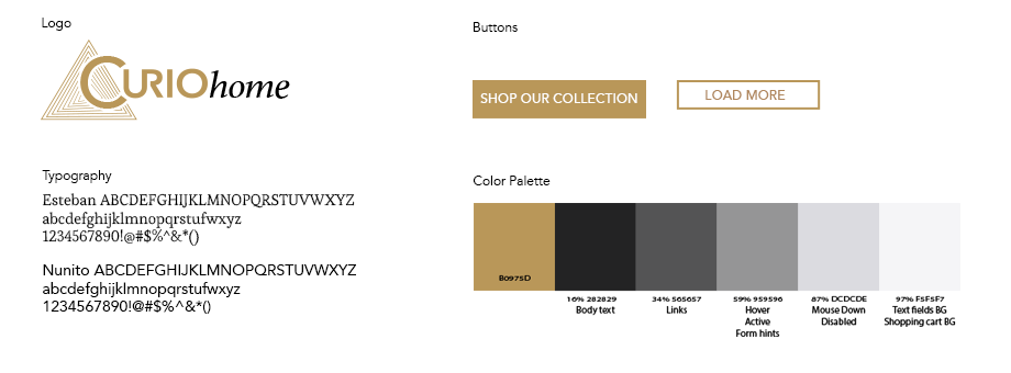
Figure 2.
Elements of the style guide.
Prototyping
The next stage is to begin the process of building prototypes. This is an iterative process involving building the prototypes, getting feedback from both stakeholders, and ideally users, evaluating the feedback and refining the design. With each iteration the prototypes are refined and become increasingly detailed and complex. The goal here is to work out as many issues as possible now, while design is fairly inexpensive, rather than discovering major problems later when costly coding and delays can seriously undermine the success or budget of the project.
First a grayscale wireframe was produced. This low fidelity prototype is simply a series of placeholder boxes in a suggested layout with placeholder text to suggest what content what might be included. While the style guide was created earlier, no imagery, color, or typography is included at this stage as the purpose of the wireframe is to determine only the layout and positioning of the various elements, and generally only on a few of the main pages. This wireframe is submitted for review and evaluation where suggestions and refinements are made, see Figure 3.
The next stage was a medium fidelity prototype in which the refinements are included and detail added. This prototype is meant to show the layout, navigation elements and includes any text, images, typography, color and all the pages necessary to suggest the user journey through the website. While this medium fidelity prototype is not interactive— i.e., it is not meant to be clickable and forms do not function— it should give the stakeholders a clear visualization of the website, it's elements, navigation, and page content, and should be professional and inviting. Again, this prototype is submitted for review and evaluation for further suggestions and refinement as part of the iterative process. If due diligence was paid during previous phases, refinements should be minor at this stage. However, any changes at this stage are still relatively inexpensive and fairly easy to make.
The third stage was high fidelity, interactive prototype. Created in Axure RP 9, this is intended to be a compete shopping journey from browsing products through to transaction confirmation. At this stage all imagery is included, typography and style elements are refined and any placeholder text, such as lorem ipsum should be replaced with realistic copy. The purpose of this is to show the stakeholder and users exactly what the elements will say and where they are positioned. Major navigation and forms are operational and while the user journey itself may be largely predetermined and not all options are available, it is possible to create an almost complete experience for the user.
At this point the high fidelity interactive prototype can be considered ready for user testing to determine the effectiveness of the user interface.
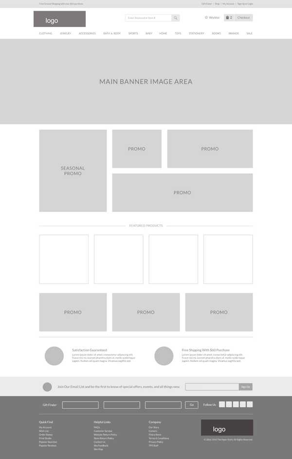
Figure 3.
Wireframe for CurioHome. Created in Axure RP9.
Testing and Evaluation
Usability evaluation helps us understand how website users interact with a website, if their experience is satisfactory or not, and if there are any pain points associated with their usage2 preventing them from completing their goal. Usability evaluation is key to improving design and creating the best possible experience for website users.3
As part of the design and prototype process for the website CurioHome, both a Heuristic Evaluation and a Cognitive Walkthrough were performed to evaluate the website and determine if any potential usability issues might exist. These "Expert Inspections" were performed by the designer and while the designer was as careful as possible not to let biases influence the evaluation, is it difficult for a designer to fully remove themselves from from the situation because the designer is intimately familiar with the user journey as designed and created. As such, formal user testing by outside parties is essential as part of the evaluation process.
For an effective testing strategy it is helpful to use a framework to guide the evaluation and in this case the D.E.C.I.D.E. framework was used. DECIDE is an acronym which references areas to consider and gives us a fairly thorough guideline for developing an evaluation process where we: Determine the goals; Explore the questions; Choose the evaluation methods; Identify the practical issues; Deal with ethical issues; and finally Evaluate, analyze, interpret, and present the data.
The Goals of the Evaluation
The purpose of this evaluation is to test several aspects of the design, information architecture, and ease of use of the CurioHome.biz website. These ares are:
- Overall design of the website:
- Is it attractive?
- Is it trustworthy?
- Does it inspire confidence in the store?
- Would a shopper be likely to make an initial purchase?
- Would a shopper be likely to return to make another purchase?
- Overall information architecture:
- is the information clearly presented.
- Is information easy to find (this includes both the products themselves and information about the products)?
- Are the product categories meaningful and logically organized.
- Is the information about a product presented in a meaningful order?
- Are the steps to complete a purchase clearly organized and understood?
- Is the website easy to use and efficient?
- Is it easy to find a product?
- Is it easy to add a product to the shopping cart?
- Is it easy to review your cart pre-purchase?
- Is it easy to make a purchase?
- Are the number of steps needed to complete a purchase appropriate?
- Are the steps in the purchase process easily understood and completed?
- Is the site visitor satisfied with the experience of using the website?
Figure 4.
What are the areas we wish to evaluate about the website
The Goals
First, we determine goals and objectives of the evaluation— i.e., what do we need to examine and why? Are the requirements for the project being met? How does the technology affect the the environment context of the website? Is the website consistent and easy to use? Can we improve the usability? These goals also influence the methods used in the study see Figure 4.
The Questions
The next step was to determine the specific questions we have about the website and how these influence the user experience. The questions asked at testing should be specific to determine both measurable, quantifiable data as well as recording reactions and comments, or quantitative data. Both types of data are important to gauge the user's experience.
The questions were formulated to ascertain whether or not the goals as defined above were met. There should be as unbiased as possible, to ask the correct questions, and to avoid leading the participant— to the extent possible. A Likert scale4 with five balanced responses with a neutral midpoint was used and ultimately a list of 30 questions was developed.
The Methods, Practical and Ethical Issues, and Evaluation Approach
Choosing, or determining the methods used to conduct the evaluation is equally necessary: what process should be used? Who will we use as test subjects and under what conditions will the evaluation be conducted? Where and when are they going to perform the test? What practical issues can arise during the evaluation and can biases, which might influence the outcome, be identified and accounted for?
It was felt that in general giving the test user several tasks to accomplish and then letting them "have at it" on their own with as little guidance as possible is the best way to test. This will let the user discover any potential problems or areas of confusion that may otherwise not be found with highly controlled testing of specific, pre-planned journeys.
Because this is an Axure prototype and not a real, fully-functioning website, certain limitations, circumstances, and confusions will invariably arise on the part of the test subject that will need to be addressed by the evaluator during the course of the testing. First, not every aspect of the website works. For example, some links are dead ends, and images can not be passed by Axure from one page to another, sowing confusion and uncertainty with the subject about why links don't work and what "products" they clicked on. Some control is therefore necessary. The subjects were treated courteously and politely and given assurances of privacy. Because the prototype was hosted on axshare.com and made publicly available no special considerations were needed and the test can be conducted as if it were a "real" website. This helped to make the testers feel more at ease.
Six participants were used and the breakdown is as follows:
- 5 were female, 1 was male (J). The male was uninterested in the products but agreed to give his opinion of the website in general.
- The age ranges were between 17 and approximately 68.
- The online shopping and general computer comfort range was excellent with all participants, except for the 68 year old whose experience was more limited.
As mentioned above the testing was minimally controlled with the evaluator sitting beside the subject for when the inevitable unforeseen circumstances arose, but with the goal of being as unobtrusive as possible. Subjects were first given a questionnaire which asked about their online shopping habits to gauge their overall familiarity with the online shopping concept and procedure. They were then asked to perform several specific tasks and were timed and monitored by the evaluator while performing the tasks. The users were asked to "think aloud" as they performed their tasks, and notes were taken. After each task a set of questions were given to the subject to gauge their experiences and gather some opinions before moving on to the next task. After all the tasks were completed a few followup questions were asked of the testers.
The Results
Quantative Test Scores
The findings indicate that users found the CurioHome website to be attractive and easy to use, with mean scores of 3.5 out of 5 and 4.5 out of 5, respectively. However, several items must be addressed: first, there is some concern about the site's professionalism, second, there is some confusion during the final step of the checkout process, third, some users were not aware of a drag-and-drop feature, see Figure 5. The results break down as follows:
For general website usage—
- Privacy and security was a big concern among the adults, less so for the young person.
- Ease of use was especially important for the inexperienced person, the other adults because of their experience level made allowances for inconveniences. The young person was at ease abandoning her shopping with the slightest inconvenience.
Attractiveness, trust, and confidence in the store—
- All the participants found the website to be fairly attractive, if perhaps a bit typical, with and average score of 3.5
- Trust and confidence was somewhat lower with an average of 3.17. The study was unable to pin down exactly why, with nobody quite able to articulate what the concerns were other than to say security was a general concern and it "just sort of looked like a small business site" and an "unknown entity"and "It just didn't look like a big, safe financial institution."
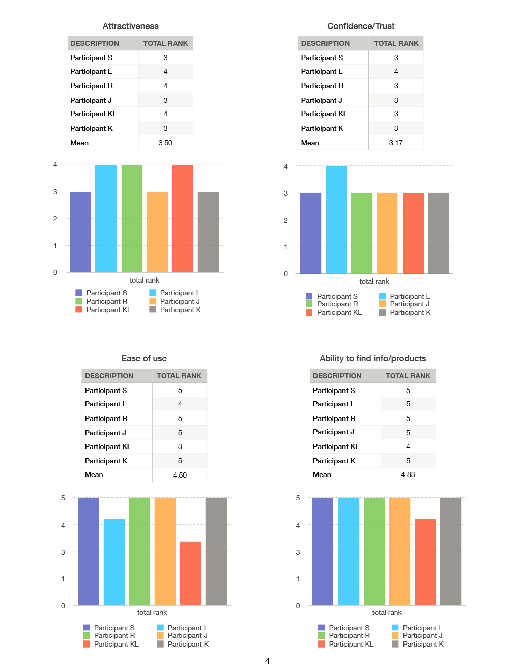
Figure 5.
Testing and Evaluation results charts.
Ease of use and ability to find products and information about products—
- Overall the site ranked will regarding ease of use and the ability to find products and information and navigate where needed with an average score of 4.5 and 4.83 respectively.
- The one notable exception was in the checkout process. While the participants ranked the website high in ease of use, observation showed that step 4 Review and Place Order was problematic for several of the users. The step requires that users click on a link called "Review your oder" in order for the "Place Order" button to become active. By this point in the process the user is already quite far down the page and because the order summary was at the top of the page there was "nothing" to review and it was not obvious that clicking the "Review your order" link was a required step in order to anchor back to the top of the page, whereupon the "Place Order" button would become active. It took active intervention on the part of the monitor to help two of the test users and took a little extra time and some scrolling around on the part of two other users to figure out that clicking the link was required.
The Analysis and Iteration— Applying the Results
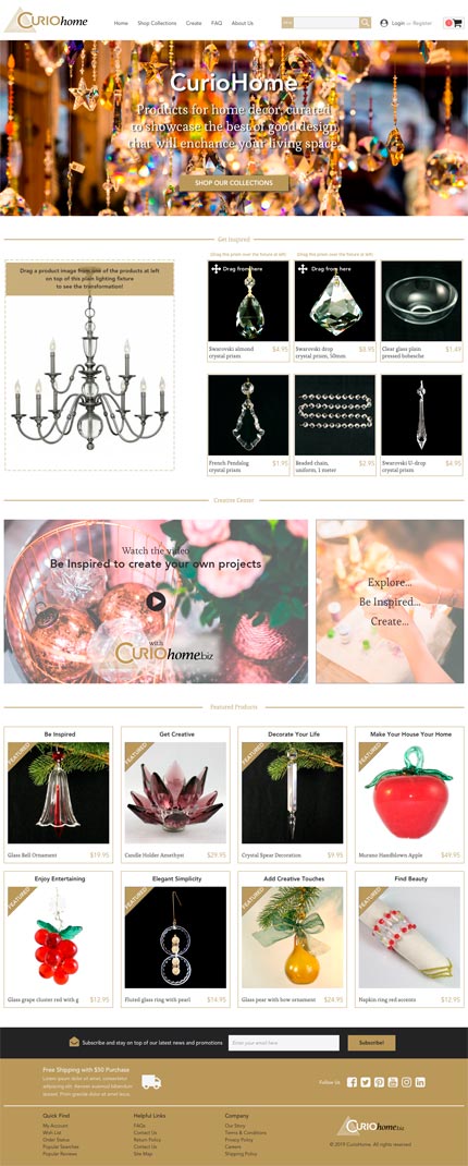
Figure 6.
Second iteration of website after applying the results of the evaluation.
A Heuristic evaluation was performed on the early designs and prototypes to check for usability issues. A Heuristic evaluation is defined as "... an evaluation method in which knowledge of typical users is applied, often guided by heuristics, to identify usability problems." 6 Heuristic Evaluation was developed by Jacob Nielsen in the early 1990s, with the following set of 10 principles that can be used to guide the inspection:7
- Visibility of system status (e.g. progress bars)
- Match between system and real world
- User control and freedom
- Consistency and standards
- Error prevention
- Recognition rather than recall
- Flexibility and efficiency of use
- Aesthetic and minimalist design
- Help users recognize, diagnose, and recover from errors
- Help and documentation
A Cognitive Walkthrough focuses on ease of learning; it looks at how easy it is to learn the website. As the expert works their way through the website during the Cognitive Walkthrough they keep the following questions in mind:8
- Will the correct action be sufficiently evident to the user? Is the website giving feedback and recognizing the user interaction so the user knows that what they are doing is successful?
- Will the user notice that the correct action is available? For example, is there a clear invitation or a "call to action" (CTA)?
- Will the user associate and interpret the response from the action correctly?
In general, most of the Heuristic principles were found to be satisfactory, with some exceptions. The Heuristic evaluation revealed that visibility of system status indicators was generally good with checkmarks indicating that each of the steps was completed, although the way the checkmarks appear is distracting. Recognition rather than recall was good because of the minimal use of icons or other metaphors.
Error prevention and recovery was ranked good with both validation and error status indicators performing as expected. The ability to find products and check out also ranked well as noted above with the Ease of use and Ability to find info/products.
One item of note is that the Heuristic points of "Consistency" and "Aesthetics" were noted as areas of concern to the professional evaluators and in fact test subjects ranked the site's Attractiveness and Confidence/Trust levels as 3.5 out of 5 and 3.17 out of 5, respectively, confirming the expert evaluations. As mentioned above, the test subjects were unable to articulate exactly what was wrong, beyond a general feeling of "not quite right" as indicated in the qualitative questions of the overall impressions. The mean scores were between 3.5 and 4 out of 5, correlating highly with the Heuristic Evaluation and quantitative scores of the test subjects.
Suggestions for improvement to the website are as follows:
- Simplify the header area by removing the gold bar at the top, and making the search field and red "cart count" circle less bold by muting the colors.
- Remove ".biz" in the logo as that might make our site seem less professional; most vetted retailers are .com.
- Make the backgrounds of the product images consistent. Currently they are a mixture of blacks, whites, and other colors. This makes for an inconsistent and unprofessional look. A white product background is used on most websites, however, clear glass shows off to its best advantage against a black background, while colored glass shows off best against white. A 50% grey background against all products should show off the products well enough and give the site a consistent look and feel.
- Many of the product images were also blurry, giving the website an unprofessional and hastily-thrown-together look.
A second area of note is the checkout process. Currently, and by necessity, the checkout form is somewhat long and as the user completes the form elements it becomes necessary to manually scroll down the page. Additionally, as noted above, by the time the user gets to step 4, Review and Place order, the user is quite far down the page and in oder to review the Order Summary, it was necessary to add a "Review" link to anchor back to the top of the page to see the Order Summary and the user MUST click that link in order to activate the "Place Order" button. The Cognitive Walkthrough suggested this might be an pain point for users and in fact 1/3 of the test subjects needed help from the moderator in order to proceed and another 1/3 of users required significant time before figuring it out on their own. Again this correlates very highly with the opinions of the expert evaluators discovered during the walkthrough. Although the the site ranked will for Ease of use with a mean score of 4.5 out of 5, this is the biggest area of concern for the entire website. The correct action is not sufficiently evident to the user. It also violates Fitts' law9 as the element the user needs to review is not sufficiently near the invitation, leading to the necessity of adding a link to anchor back up the page, complicating the site's functionality and aesthetics. Suggestions for improvement are as follows:
- The checkout page should automatically scroll down as the user tabs between, or clicks on, form fields, or clicks to complete each step.
- The delivery method check mark was distracting as it has an odd little elastic bounce as it animates in from the left side. A simple animation should suffice which will be consistent with the other steps. This should make the site appear simpler.
- The Apartment field should not have an * (asterisk) if it is optional.
- The Order Summary should also automatically move down the page at the same rate as the user as they complete the form, thus keeping the Summary within sight, reducing the need for the user to remember, and eliminating the need for the additional Review your order link.
Iteration
Once the site is updated the iterative process continues. Budget and time constraints may prevent another round of testing and evaluation, but ideally this should be done to optimize the user experience. The product development lifecycle when conducted effectively, from initial concept to needs requirement extraction, ideation, prototyping, testing and evaluation, and finally to redesign should ultimately create a product that meets the needs of all concerned. All product development will benefit by the process, and digital products especially can be better designed and improved for the best user experience possible, see Figure 6.
Endnotes
1 Helen Sharp, Yvonne Rogers, and Jennifer Preece, Interaction Design: beyond human-computer interaction, Fifth Edition (Indianapolis, IN, John Wiley & Sons, Inc., 2019), 496.
2 Mandahar, Ishan, "Measuring UX: Usability Evaluation" https://blog.prototypr.io/what-and-why-of-usability- evaluation-46bf4b6dee07, (Feb. 2).
3 Aurora Harley, "What is a Design Review" https://www.nngroup.com/articles/ux-expert-reviews/, 2018.
4 Saul McLeod, "Likert Scale Definition, Example and Analysis" https://www.simplypsychology.org/likert- scale.html, Updated 2019.
5 Helen Sharp, Yvonne Rogers, and Jennifer Preece, Interaction Design: beyond human-computer interaction, 518-519
6 Helen Sharp, Yvonne Rogers, and Jennifer Preece, Interaction Design: beyond human-computer interaction, 515.
7 Rex Hartson and Perdha S. Pyla, The UX Book Process and guidelines for ensuring a aquality user experience, (Waltham, MA, Morgan Kaufmann (Elsevier), 20112), 473-474.
8 Kristian Secor, User Experience (UX) Design II lecture and slides (UCSD Extension, San Diego, CA, 2015)
9 Fitts' Law, developed in 1954 is generally summarized as: The time it takes a user to point to a target is determined by its distance and the size of the target. The farther away and smaller a target it, the longer it will take a user to point to it.