
UX Case Study
OBJECTIVE:
To identify usability issues on Dixieline's web platform.
Introduction
Dixieline is a hardware store chain and brands itself as a “Lumber and Home Center.” With 10 locations around the Greater San Diego area it is competing with Home Depot, Lowes, and Ace Hardware and like those chain stores not only do they sell tools and building materials, but they also try to find a niche to survive in the crowded home repair and remodeling field by offering products, design and installation services for kitchen and bath remodeling; and window and door replacement products, design, and installation services. Founded in 1913, the company built its reputation on strong customer service and as part of the Dixieline brand they claim to employ knowledgable sales staff and, in at least one store and presumably each store, has a large center counter area where retail customers or building contractors can walk up to and ask questions directly to their staff. Each store does have one or two showrooms dedicated to Kitchens & Baths, and or Windows & Doors. One location has a “Design Center.”
Dixieline.com is the online portal for Dixieline and the site is used for branding and marketing, as it currently stands its only goal appears to be to convert a website visitor into a walk-in customer at one of their home centers.
The Goal
While using the website in the past, several “frustrations” were encountered and the purpose of this case study is to:
- Validate, or invalidate these “frustrations” through user testing;
- Clarify and refine these feelings of dissatisfaction into quantifiable and specific paint points so they can be targeted and addressed;
- Suggest possible solutions to increase the site visitor’s overall satisfaction by refining the user’s interaction with the website.
This should help to improve the user experience and strengthen the Dixieline brand.
Evaluation
Earlier, the word “frustration” was used and while this term is vague and non-measurable it does convey feelings of dissatisfaction and is very much at odds with a good user experience. A user’s conscious awareness of frustration is a red flag and a clear indicator that something is wrong. To distill this feeling into specific identifiable problems the first step requires testing and collection of data and to do this two methods of evaluation were used: Self Analysis and User Observation and Testing.
The Methodology
Self Analysis
The first method used to evaluate the website was to perform a Self Analysis— which means the author of this case study uses his own experience and knowledge to initially assess the website. To do this successfully the assessor must attempt to step back from his or her preconceived biases and one technique to help with this is to perform a Cognitive Walkthrough which sets up a pre-defined and specific set of tasks to perform and these tasks are timed and have quantifiable results. Later, during the outside user testing phase these same tasks are set, both to evaluate the website and evaluate the assessor’s cognitive walkthrough for validity. The second Self Analysis method used was to perform a Heuristic Analysis. In the field of User Interface Design, heuristic analysis can be defined as any analysis that can be performed by trying. There are nine general rules outlined by Jacob Nielson and Rolf Molich who contend that an experienced evaluator can find 75% of the problems that exist if they violate one of the nine heuristics.
User Observation and Testing
For this test "Guerrilla Usability Testing" was conducted. Four users were selected and were assigned the same set of tasks as were used in the Cognitive Walkthrough (see Figures 1, and 2). The users were asked verbally to perform each of the tasks, and a Task Analysis was performed, noting the users performance and reactions, and the time needed to perform the tasks. In this case study the “back-of-the-envelope” analysis method was used to detect large-scale problems and because the tasks were fairly easy.
While performing the tasks the users were asked to “think aloud” so the observer could take notes. Users were also asked what they were thinking and why, and why they were performing the actions they did. After the tasks were performed the users were asked a short series of questions about their experience to get insights into the specific user experiences. The observer was as careful as possible not to assist the user and not to ask leading questions or providing improper tips, either verbally or non-verbally.
Because Dixieline brands itself as a design center with both kitchen and bath, and window and door showrooms the tasks were designed to focus on the website’s strength in those areas, rather than look for fault in a segment it does not cater to. Dixieline does appear offer products for sale directly on the Website and that was tested as well.
Analysis
Once the data has been gathered a contextual analysis begins. The first step is to gather the raw data and from that extract work activity notes which are simple declarative statements that have been paraphrased from the raw data. The next step is to gather the work activity notes into common groups. Themes then begin to appear and those themes help define the problem areas with the user interface.
From there a Requirements Analysis performed and Hierarchical Task Inventory model is created and when compared to the work activity notes a barrier summary can be deduced.
Results
Testing discovered three distinct problems with usability on the website that fall generally within the area of information architecture or within the site structure itself.
All users were asked to perform the following tasks:
- The Home page shows 5 items for sale on the website:
- Find more information (e.g. a product review, or a more detailed description) on any one of the items for sale (your choice of item).
- Purchase the item (you do not need to complete the purchase).
- You want to remodel your kitchen but you don’t know what design style you like or where to start:
- Find some basic information on the kitchen remodel process (for example what steps are involved in a kitchen remodel) or find some basic information on kitchen cabinets or countertops (for example the differences between various common countertop materials).
- Look for kitchen designs to determine what style you like and pick a style.
- Find and fill out a form to have someone contact you (you do not need to submit).
- You need to replace the aging and inefficient windows in your home. Assume you know nothing about windows or energy efficiency:
- Find some information on different types of replacement windows and energy efficiency.
- Find any style of window you like.
- Find and fill out a form to get an estimate (you do not need to submit).
- You want to drywall your garage and do it yourself. Search for the specific building materials, tools, and hardware you need:
- Find the appropriate drywall, a price, and availability.
- You will need a drywall screw gun, find a price, specifications, and a review for the model of your choice.
- Find the appropriate drywall screws to install the drywall, find a price, and availability.
Figure 2.
Typical example of the page found under Departments. It is filled with lists upon lists of categories of tools available if one visits a store. None of it is a clickable lick.
Problem 1— Lack of Content
By far the overwhelming pain point for users is lack of information content. During the self analysis phase of research it was thought that this lack of information might be a problem for users and this was confirmed through outside user testing. The website appears to exist simply to urge site visitors into one of their store locations. See Figure 3 as an example of the tools page. As an aside, to this degree it must be acknowledged that the site is effective with 75% of respondents ranking their desire to visit a store between 6 and 8 out of 10. Even the one respondent who gave the site a 5 because she was extremely frustrated with the website overall and by extension Dixieline, conceeded that the images of the kitchen and bath designs she found were beautiful and did want to visit a showroom.
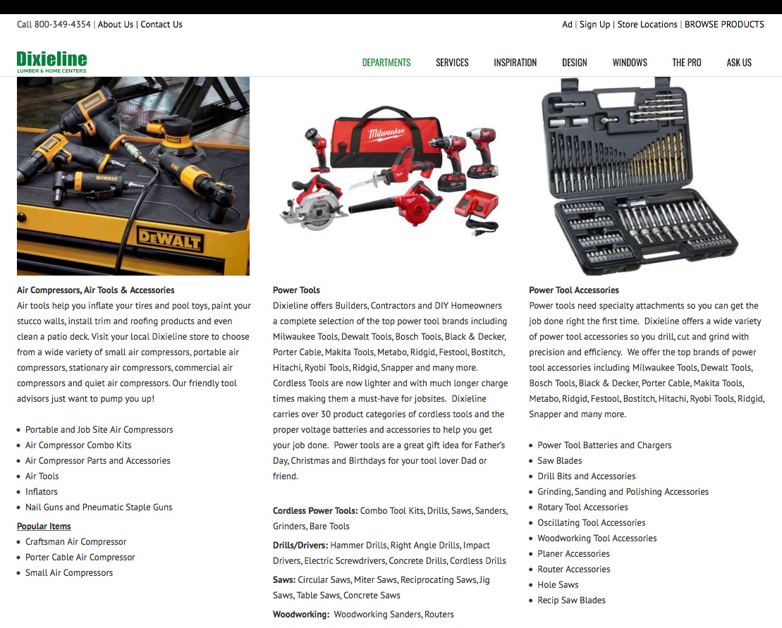
Figure 3.
Typical example of the page found under Departments. It is filled with lists upon lists of categories of tools available if one visits a store. None of it is a clickable link.
Justification
That being said, all the respondents were very dissatisfied with their visit to the website as evidenced by a ranking average of 2 out of 5 across all respondents. A deeper dive found that the reason for the dissatisfaction lay in the answers to the questions: “Overall, do you feel you were able to accomplish the tasks set for you? and “Overall, were you able to find the information you were looking for?” with an average score of 1.5 and 1 respectively. See Figure 4 for a breakdown of satisfaction scores. This lack of information and content was manifest across all tasks (except for tasks 2.c and 3.c, find a contact form) with general information missing, and specific product information and even entire product categories missing from the “shopping cart” experience.
All tasks were tracked for time and followup questions were asked. For example, for task 1.a (find information on the product of your choice) the time for user L was 1:09 (min:sec) before she gave up and reported “Arrg, this is ridiculous! I clicked and followed the links like I was supposed to and I don’t know where I am! This site is very misleading!” (In fact the link path was circular taking her eventually back to the Home page.) User S gave up after 24 seconds having been directed through the same circular set of links back to where she started, except for a different product. Users J and R had similar results.) Tasks 2.a and 3.a were more open-ended because the users were looking for general information and the times were much longer as a result, however, 75% of users were unable to complete the tasks, having given up after between 2 and 5 minutes and reported being unable to find any information. See Figure 5 for a complete breakdown of times per task. One dedicated user was timed at 7:05. When asked directly what she was trying to do she responded “I want to find out some information about natural stone countertops and how to maintain them.” It must be noted that this user, R, was able to find information to her satisfaction, but only by scrolling to the very bottom of the second page she visited, and finding a series of logos for the manufacturers and following a link off-site to the manufacturers own website.
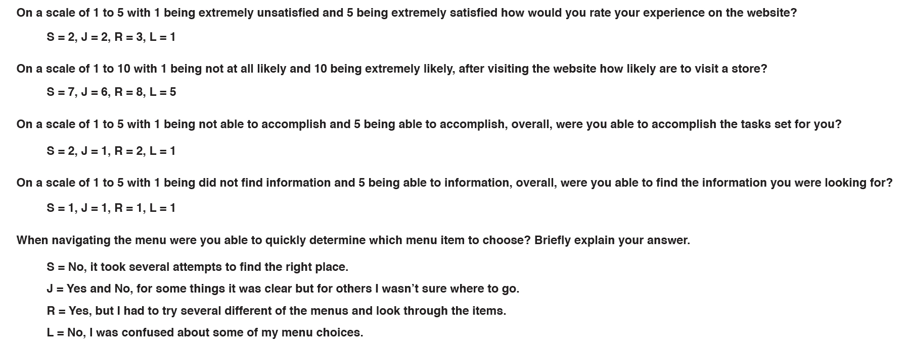
Figure 4.
Breakdown of satisfaction scores per participant. Very low scores were given for measures of satisfaction.

Figure 5.
Times to complete tasks. Except for tasks 2.c and 3.c, filling out a contact form, three of the users gave up and did not complete the task. only user R made the effort to go offsite to find some information to her satisfaction.
Problem 1— Solution
The solution in this case is to add more copy and information to the website. Post-test interviews suggest it doesn’t need to be a lot of thorough information, either. Users felt that if a visitor is taking the time to browse through the site looking at at remodeling projects they are obviously interested and Dixieline should offer some assurances to visitors that they know what they are talking about and offer quality products from quality suppliers. Simple articles such as that found at https://www.popularmechanics.com/home/interior-projects/how-to/a3080/how-to-choose-the-right-countertop/ would be sufficient for most of the users. See figure 3 for an example of a typical Dixieline detail page. The website does offer precisely three “How To” videos (none of the users found that link) but it is felt that more information can easily be provided, perhaps by asking Dixieline’s own experts to write or coauthor an article or, at the least, have links to outside sources. Keeping site visitors on the page is considered a best practice design pattern, however, offering a link to outside information would increase the overall satisfaction. (User R was satisfied to find information offsite the— only user to do so— and gave the site a 3 out of 5 as compared to 1s and 2s from the other three users.
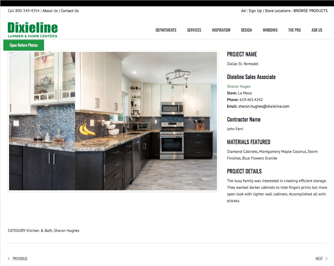
Figure 6.
When clicking on a gallery image it opens a page with contact info for the Dixieline Sales Associate which is good but, as several participants noted, almost no other useful information. One can only guess at what is being referred to under the Materials Featured section; is “Diamond” a cabinet manufacturer and what is “Storm Finishes?”
Justification
Users reported that they wanted to find information about the products and services listed on the website. Statements like: “I want information about (X) product” or “I can’t find any information about cabinets; I want to know if they are durable” or “They only gave me contact information of the Sales Associate. In the materials list it only says they used ‘kitchen cabinets.’ Duh!” or “I see a mention of ‘Diamond Cabinets’ but I don’t know what that is.” See Figure 6 as a typical example of a project "gallery". For Kitchens & Baths they were looking for a summary or general outline about what is involved in the remodeling process, for example, a general outline of the steps involved. Also, the users wanted at least some information about the types of materials used because with so many choices available they wanted to know what material might be “best” or at least find a brief discussion of the benefits and drawbacks of each type of material. Users also wanted to know about the cabinet or window manufacturers. With so much interest in home remodeling and renovation as exemplified by the fact that there are entire TV channels dedicated to home remodeling (HGTV), remodeling TV shows too numerous to list, and an abundance of online articles about home remodeling it is clear that people want more information. One would expect Consumer Reports to have articles related to quality of home remodeling products, but even popular mechanics, a magazine more dedicated to engineering and mechanics than home remodeling, has articles on the pros and cons of the various kitchen countertop materials. Lastly, Dixieline’s major competitor, Home Depot has an onsite page about what to expect during a kitchen remodel (Home Depot what to expect during your kitchen remodel). There is in general a longing for more information about home remodeling projects and most consumers seek some level of information before they begin a project of this complexity and expense. User experience can only improve by offering the visitor what they want.
Problem 2— Site Navigation
The second pain point for users was confusion over site-wide navigation. During the Self Analysis phase, while it was clear that one would probably start with the menu item “Inspiration” to find pictures of kitchen, baths, windows, and doors, and this was confirmed during user testing. It was not clear where one would start to find general information. Perhaps the “Departments” menu link? What is the “Design” link for? And why is there a top level menu items for “Windows” but not for “Kitchens” or “Baths”? Why is “Lumber Distribution” under the “Services” menu and not under the “The Pro” menu? On top of that it took the author of this study almost five years of visiting the Dixieline website off and on before he discovered the “BROWSE PRODUCTS” link hidden in a different navigation menu altogether. See Figure 7 to see the existing dixieline.com navigation. User testing confirmed this analysis as well. While users were working through their tasks and thinking aloud 50% of users wondered, to find information do I go to Design or Departments?
Screen captures of existing site showing duplicate and confusing navigation choices. There are duplicate links under several of the navigation menu items and duplicates are found across the sets of navigation bars.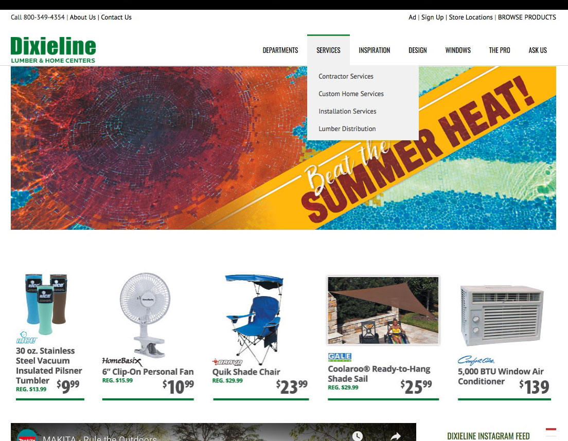
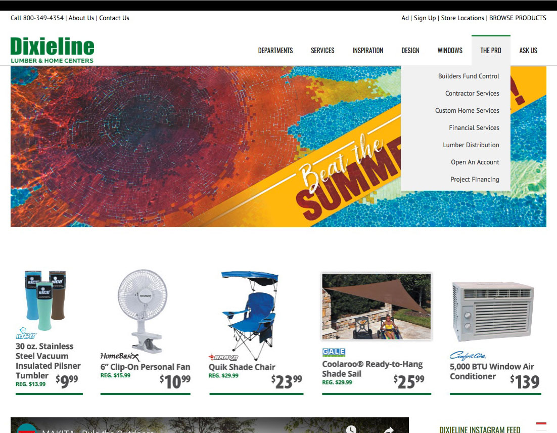
Figure 7.
Justification
As mentioned above, when the test users were set the tasks to find a product style they like (tasks 2.b and 3.b) 75% of the participants went to the Inspiration menu item first with the other user starting at Departments. User R, when looking for kitchen styles she liked, did head to the Inspiration menu. From there she selected the Kitchen & Bath Gallery option which opened a page of 4 rows of 4 pictures and a 5th row of 2 pictures. The pictures were very small and were labeled with a confusing mix of names such as Drake 1, Larenda Lane, Badgett, Rancho Bernardo1, The New Historic, Bodkin Hall Traditional, Dallas St. Remodel, etc. There seems to be no rhyme or reason to the names and some are clearly project references and not styles, such as French Country or Modern. Hovering over an image turned it green with an invitation to Zoom or View. Clicking on the View link opened up the project page with a carousel of 2 to 4 images of a remodeling project that Dixieline completed. The user then had to click the back button and select a different project and click View to look at that projects carousel photos. User S gave up after 2:06 saying the process was too cumbersome. User R said, “I can’t see what these are so I’ll pick one at random. No info, not many choices.” She repeated this a few times then went to Design>Kitchen & Bath Centers, which only lists which showrooms are at which store locations, then gave up at 4:49 and said “I’m going to Pinterest to do basic ground-level work.” During the process each user was asked what they were trying to do, with all responses typified by the response from L, “I only want to look at lots of different styles of kitchens! It shouldn’t be this hard!”
Of the 12 categories listed in the Departments, only Decking had subcategories and there were separate categories for both Outdoor Living and Patio Furniture (a patio is generally considered an outdoor space).
- Services has sub-categories for Contractor Services, Custom Home Services (which implies Dixieline builds custom homes), Installation Services, and Lumber Distribution (which should probably be under the The Pro menu item).
- Inspiration has a Custom Home Gallery category that links to a page offering a link to Window Replacement, which itself has a link to Get An Estimate, a two-sentence paragraph about Dixieline’s superior customer service, and two images that link to the same kitchen and bath remodels found in Kitchen & Bath Gallery.
- The Windows menu item has, among other things, links to Products And Services, How To Videos (which is a different set of How To videos than mentioned above), and a Windows Facebook Page (which isn’t available).
- The Pro menu has a link to Financial Services, Custom Home Services (which has the same name but leads to a different page than the link in the Services menu), and Lumber Distribution (which is the same link as in Services and leads to the same page), among others.
- Ask Us has links to About Us (which is a duplicate link as is also found above the logo), Contact Us (which is also a duplicate of the link found above the logo next to About Us), The Design Team (which is a duplicate of the same link found under the Design menu item, Hard To Find Items (which is their only search function and is a contact form and not a search function), How To Videos (Same name but a page of 3 videos), and Window Estimate (which is different from Request Windows Estimate found under the Windows menu item and leads to a different sub-domain).
Above the logo on the left there is another smaller set of navigation links of which the first is their toll free number (and not a ink at all) | About Us | Contact Us.
Finally, in the upper right corner of the page is a third set of smaller size links: Ad | Sign Up | Store Locations | BROWSE PRODUCTS. 75% of users never found the BROWSE PRODUCTS link during testing of tasks 1.a, b and 4.a, b, c. One of the users, L, did find the link but only after testing had finished and while glancing at her screen when answering the post-testing questions. The one user, R, who did find the BROWSE PRODUCTS link found it at 2:37 after having visited Departments and finding nothing there then looked through the choices in the Services link, and then when looking for the Search feature which is normally found in the upper right corner instead found that link. The BROWSE PRODUCTS link takes a visitor to an entirely different sub-domain with what should function as an e-commerce store but that has never been completed, still has missing products (“We are adding products daily, so please check back soon!”), and is missing shopping cart functionality which has never been added. This entire missing functionality will be addressed as problem 3. However, the navigation in this other sub-site itself does not follow traditional design patterns for modern navigation, using the technique of displaying a dropdown overlay for each menu item, then another overlay for each category within the menu item, then another overlay for any sub-sub-category, then a fourth overlay if a further breakdown required. See Figure 8 for an example of the existing navigation anti-pattern.
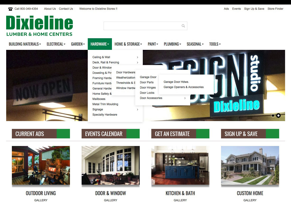
Figure 8.
Anti-pattern. The navigation menu drops down with overlays upon overlays. All too frequently category headings are incomplete.
Problem 2— Solution
Because this site is Dixieline’s branding and marketing site the main navigation has been reworked and the site the goal is still to bring customers into a store. The shopping category still takes the user to a separate sub-domain to keep the store separate from the branding.
Justification
The information architecture of this site clearly needs to be addressed. All of the participants spend quite some time trying different menus to find what they were looking for and the time for several of the tasks was as much as 4 or more minutes. A restructured navigation system that leads directly to a page with the information the user is looking for is a standard design pattern. See Figure 9 for a redesign option. Each marketing segment now gets its own menu item starting with Kitchens & Baths, then Windows & Doors, Design & Remodeling, etc. Because this is Dixieline’s branding site each market segment is highlighted and sub-category options are clear within each segment. The intent is to provide users with clear navigation that not duplicated across different navigation menus and unambiguous choices for where to find the information they may be looking for. As stated above the intent is still to drive site visitors into a store. Initial user testing of this non-interactive wireframe solution seems to confirm a higher level of satisfaction with user S saying, “This looks a lot better organized.” and user L saying, “This gives me a better understanding of where to go. The categories are much clearer.”
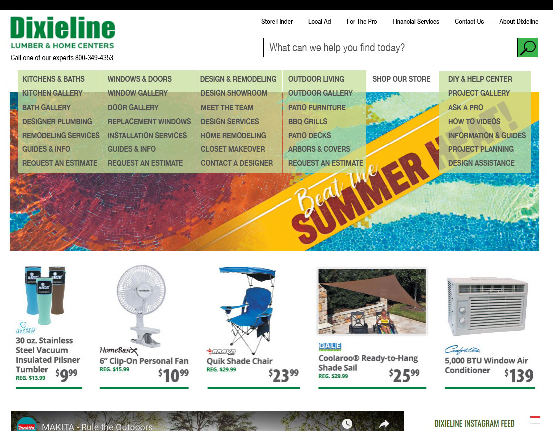
Figure 9.
Header and Navigation re-design. This design highlights the market segments that Dixieline is trying to capture with emphasis on their design and remodeling services. Galleries are specific to the type of service category and FAQs, project guides, hand-holding and more info are available especially to build confidence for first-timers. There is always an easy link to request an estimate. The Store category is it’s own set of information architecture.
Problem 3— Confusion
In this case the confusion is not on the part of the user, but that the website can’t seem to decide on its purpose. It seems to want to sell products and shows items on the Home page that are for sale but there is no shopping cart to buy them and clicking on any of the images takes the user to a jpeg image of the flyer. Clicking the image of the flyer then takes the user back again to the Home page, see Figure 10. The implied list of products promised under Departments wasn’t delivered upon and no actual products are listed. Finding products was equally frustrating for the participants with tasks 1.a and 4.a, b, c. Even for the users who did find the BROWSE PRODUCTS sub-domain site it was incomplete with products missing, incomplete product information and a shopping cart that is missing.
Clicking on any of the 5 products shown on the Home page brings the visitor to this page. The heading, while a link, does not inform nor provide an invitation as to what to do next. The image is simply a jpg of Dixieline’s current ad. The heading link when clicked takes the visitor in a circle back to the home page.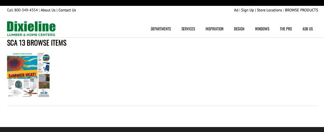
Figure 10.
Justification
User L (the last of the 4 participants), rather than looking for Drywall for task 4 wanted instead to look at patio furniture and the author allowed this hoping for better luck in this category but like building materials, tools, and hardware the results were equally disappointing. The patio furniture page had, for example, a single photo of a patio table and chairs labeled Patio Dining Sets, however, neither the image or heading was a link and it was impossible to view gallery of the different types of patio furniture. This caused L to exclaim “Site is very misleading! If you have a link for patio dining sets I should be able to see patio dining sets, not just a picture. And patio furniture by Category shows only a single picture but it’s labeled Patio Chairs but I can’t get to the product pages.” In fact, many of the categories in the Departments menu item are simply a single page containing a few images, a paragraph of text saying these products are available at Dixieline locations, bulleted lists of sub-categories of items, and maybe a few manufacturers logos, and no links to anything else.
Further, in the BROWSE PRODUCTS sub-domain clicking on a product on a category page brings up a product detail page with some information about the product. Unfortunately, the amount of information is highly variable between products with some descriptions almost completely missing, see Figure 11, and other products containing the usual information one would expect to find in any other detail page on another site. The one user, R, who did find this sub-domain clicked on the link saying, Check Price and Availability only to find it brought up a map and a list of all the Dixieline store locations. The entire procedure for task 4.a, b, c took her fully 9:54 and, determined to complete the task assigned, finally found a price on the products by going to Home Depot.
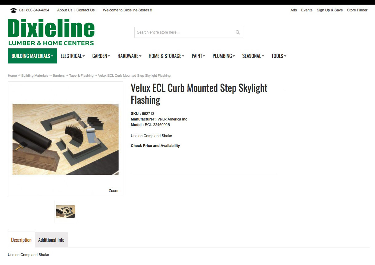
Figure 11.
The BROWSE PRODUCTS sub-domain site has products listed. It looks as if it is intended to be a store and the author surmises that it was added years ago with the intent to finish it, but never completed and just left half finished.
Problem 3— Solution
Dixieline actually has a fairly complete “store” as a separate sub-domain (different from the BROWSE PRODUCTS sub-domain) consisting of a full range of kitchen and bath products. Found hidden in the Design navigation menu as a sub-category named Designer Plumbing it is almost a fully functional e-commerce platform with category pages and product detail pages, see Figure 12. With over 15,500 products ranging from mirrors to tubs to sinks to faucets to cabinets to countertops this secondary site is actually very attractive and fairly complete. It lacks only a little better filtering and integrating a functioning shopping cart. The recommendation would be abandon the BROWSE PRODUCTS sub-site and to implement this nearly complete sub-site across Dixieline’s full range of products and add full shopping cart functionality.
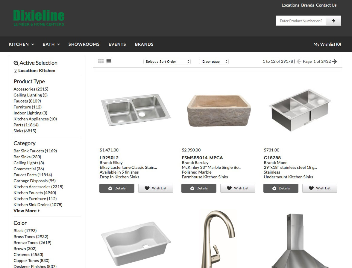
Figure 12.
TDixieline has good start to an e-commerce store. As an example of a sub-optimal user interface this “hidden store” was not found by any of the external users and only found by the author of this case study while performing his self analysis.
Justification
A fully functioning shopping cart would increase revenue from potential customers who are unable to go to a store for various reasons. To quote user J, “Why have a website that says it offers products for sale if it’s not functional and offers no products and no store?” User R, however, suggested that Dixieline did not want the added expense of maintaining an e-commerce platform, citing “the entire city of Seattle is devoted to maintaining Amazon, and Dixieline is a lot smaller.” While this may be overly dramatic for the sake of the argument, the fact is that there are many shopping cart platforms for small, medium, and large retailers alike. User L, who found the BROWSE PRODUCTS link after the fact, also commented that it was not helpful, wanted to find products to buy and was ultimately even more angered at Dixieline because they promised and failed to deliver. That seems to sum up the situation: don’t make a promise if you can’t deliver. When shown this different “store” site during later testing user L commented, “Wait. What is this? Is this different from that other one? Where was this? This is a lot nicer than that other one and way better than that useless Departments link.” User J commented, “This looks like a real store.”
Summary
Dixieline is a modern hardware store, branding itself as a Lumber & Home Center. Like its competition it sells a wide range of products for the home, both inside and out. Competing with Home Depot and Lowes it tries to find its market niche by offering home remodeling services and specializes in kitchen and bath remodels, window and door replacement services, and services to contractors and builders. The website, dixieline.com, seems to be caught in limbo. As it exists now its purpose seems to be simply to entice customers into one of its nine locations. The site implies that it offers products for sale online, but in reality it does not— which frustrates site visitors. The site offers galleries of kitchen and bath designs and windows, but the galleries are cumbersome to use and there is no information other than contact information of Dixieline sales associates. Further, navigation and site structure appear to be poorly planned, giving the overall impression that the site was thrown together to make Dixieline appear “modern” with an online presence. Product and service categories are poorly placed, or missing entirely, leading to confused navigation, and individual products are not listed. Further, a hidden store, when found, offers no better functionality with the shopping cart functionality entirely missing and large segments of product categories and individual products still to be added.
While effective at urging customers into the store, the site has fundamental problems of poorly implemented information architecture resulting in confusing or duplicate navigation elements and duplicate pages with the same content or duplicate page titles with different content. The site also missing meaningful content for site visitors, with most pages merely urging site visitors to visit a store to see the products or the showrooms. Lastly an unfinished attempt to add e-commerce functionality only angers users further as a shopping cart seems to be promised but never implemented. These paint points are of serious concern for user experience.