
UX Case Study— Part 1, Evaluation
OBJECTIVE:
To identify usability issues on Wells Industries' web platform
and propose a solution that will effectively meet the needs of the user.
See Part II, Redesign for the interactive prototype.
Introduction
Wells Industries is a custom manufacturer of, primarily, metal furniture. Established in 1994 and based in El Paso, TX, they are a small, family owned and operated business with metal-working traditions going back several generations. Wells Industries has had an online presence since about 2001 but has not been aggressive with online marketing or outreach: their site currently ranks at over 7million. Wells Industries sells “to the trade” meaning they do not sell directly to the consumer but to Interior Designers.
The company was, up until very recently, on the list of preferred vendors to a national hotel chain, helping to drive designers to the Wells website, and which acted as vetting by proxy. Now without this preferred vendor status, the company will certainly need more traditional marketing and outreach to designers for both their hospitality design and home design markets. Additionally, a printed catalog in design studio libraries helps create awareness and helps to drive visitors to their website.
However, because designers look to the web more than a printed catalog it is important to keep a website up-to-date. Numerous studies have shown that an attractive design builds trust and creates positive feelings. This is especially true in the design field where a website that looks out-of-date may unintentionally convey to a site visitor that the products themselves are out of style. Additionally, with the use of mobile devices increasing, and in fact overtaking desktop usage, it is necessary that a website have a mobile friendly design.
Attractiveness alone is not the end goal. A website’s usability is equally important to build trust and create a positive user experience. A website that has an awkward or difficult user interface will quickly be abandoned if site is difficult to use or the user can not find the information he or she is seeking. Psychologically, a website that looks broken reduces trust in a company that may otherwise pride itself on attention to detail.
The Goal
To improve the user experience and strengthen the Wells Industries' brand the goal for this case study is to:
- Examine the existing website to discover any usability concerns with the user interface or user expectations;
- Suggest possible solutions to increase the site visitor’s overall satisfaction by refining the user’s interaction with the website.
- Suggest any necessary changes to the design to bring the website up to a more modern design style and responsive standards;
- Create an updated site design to help their trade clients and convert browsing into quote requests and improve the click-through-rate. (See Part II for the redesign.)
Evaluation
For this website an abridged contextual inquiry was performed. Because this website is intended for users who are in the trade and thus familiar with ordering custom furniture and are familiar with furniture specifications it can be assumed that they are more experienced than the average consumer. As such it was felt that a smaller number of testers would be sufficient. In this case two users were found to participate in user testing one of whom was an Interior Designer, and the other a designer whose work role is Purchasing Agent and Product Specifier for a design studio. Both users were familiar with the site and had used it in the past. Because the website has only one purpose, a single work practice was performed: Find any product, customize it, and get a price quote. The users were asked to think aloud so the observer could take notes. Users were also asked questions about what they were thinking and why they were performing the actions they did.
Additionally, a Cognitive Walkthrough was performed to detect any additional problems with the website and this analysis was compared to the results of the user testing to confirm commonalities as well as discover any additional issues not found during user testing.
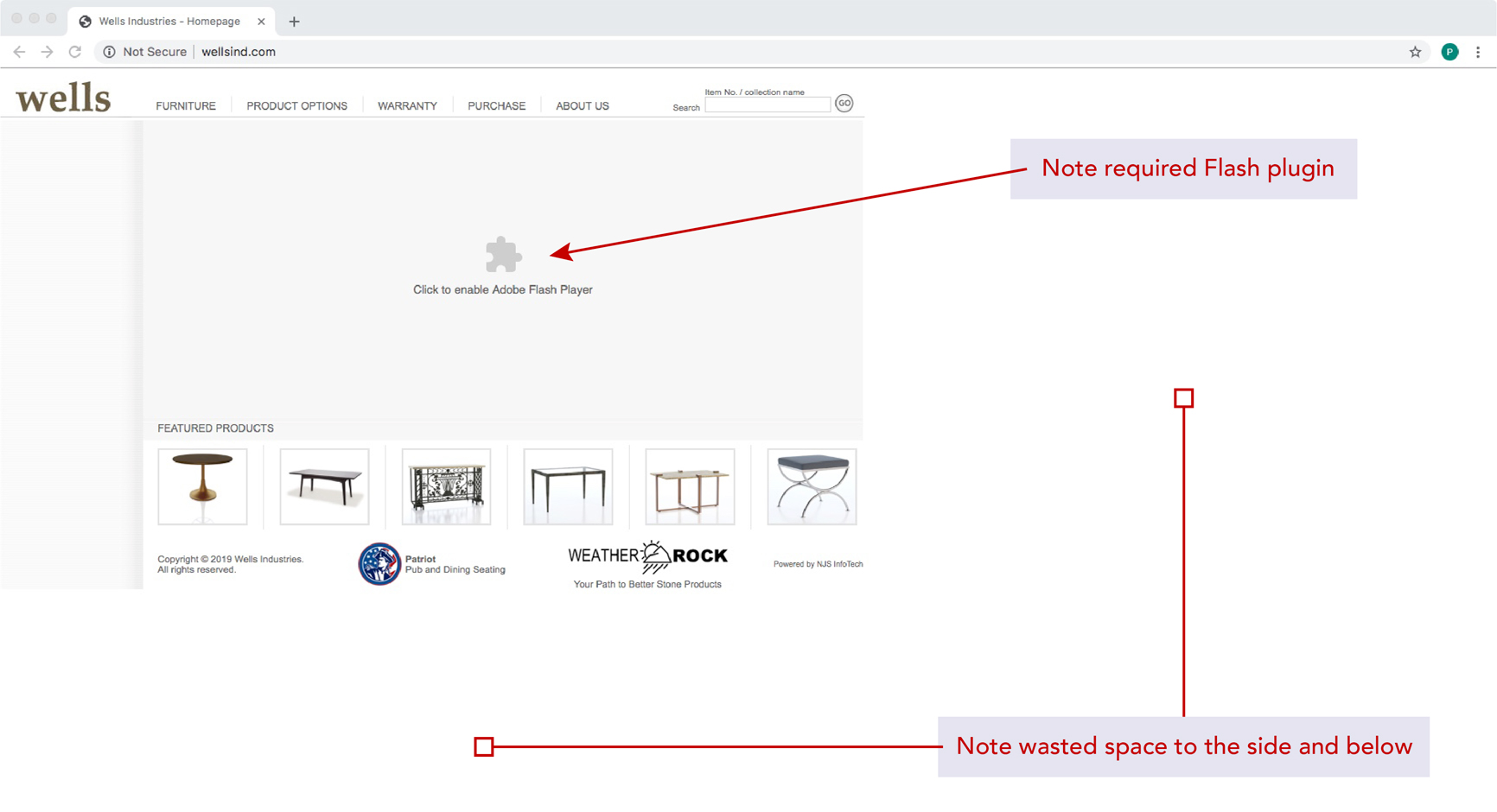
Figure 1.
Figure 1. Wells Industries home page.
Problem 1— Website design is out of date, uses out of date technology, and is not mobile responsive.
As it currently stands the website’s major problem is the use out of date technology. It relies on Flash to display a slide show of three product images on the home page. This forces user to install Flash and load a plugin to see the images in the slide show. While not strictly necessary for site functionality, the site does look broken without it which which diminishes the user experience. See Figure 1.
Secondly, the website is not mobile responsive. This was tested both by using the Developer tools in Google Chrome and also using Small SEO Tools mobile friendly test to perform a mobile friendly test, as well as Google’s mobile friendly test.
The results showed the site was not mobile friendly and several issues were encountered, including: Text too small to read; Clickable items were too close together; Content was wider than the screen; and that it Uses incompatible plugins. See Figure 4. Page load speed tests rank as excellent with tools.pingdom.com giving it a performance grade of 83 or "B", and a score of 100 on Google Speed Test, see Figure 2.
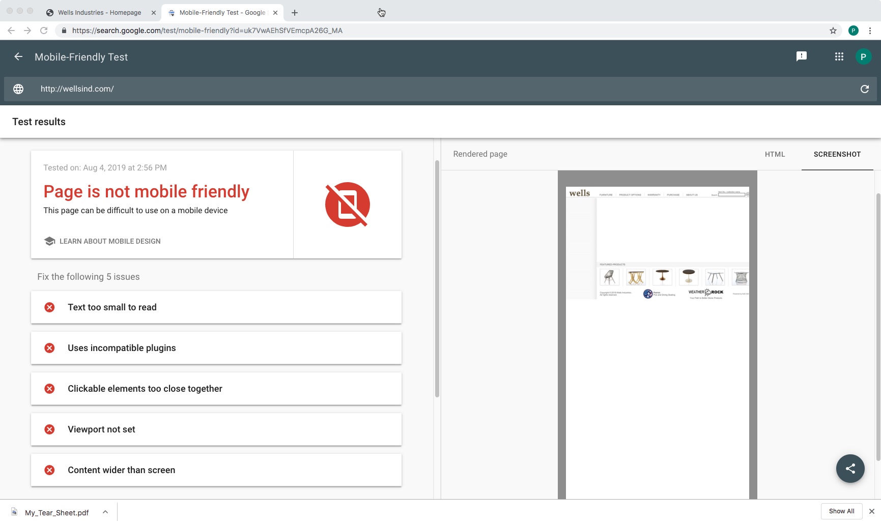
Figure 2.
Mobile friendly test results.
In addition, the website does not use the available screen space effectively. The site bunches up all the content in the upper left corner, leaving the entire right half and the lower third of the desktop viewport completely unused. On mobile the content is slightly wider than the screen and takes up only the upper third of the height of a screen. This is a wasted opportunity both from a usability standpoint and from a content standpoint.
The navigation is inefficient as well. While a reevaluation of the information architectures is not requited because the site structure is simple, it needs to be brought up to current usability standards. It is too small to read on mobile devices and is inefficient and creates unnecessary mouse or hand movement for the user. Specifically there is a horizontal main menu across the top but each item when clicked then displays a secondary vertical menu of the sub-options in a thin left column, see Figures 3 and 4
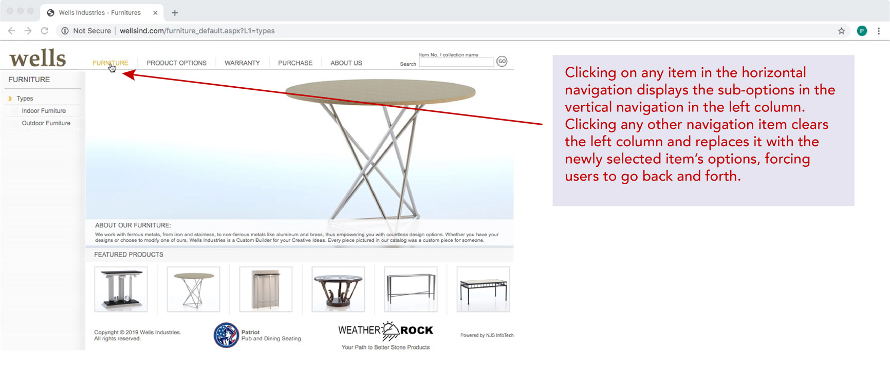
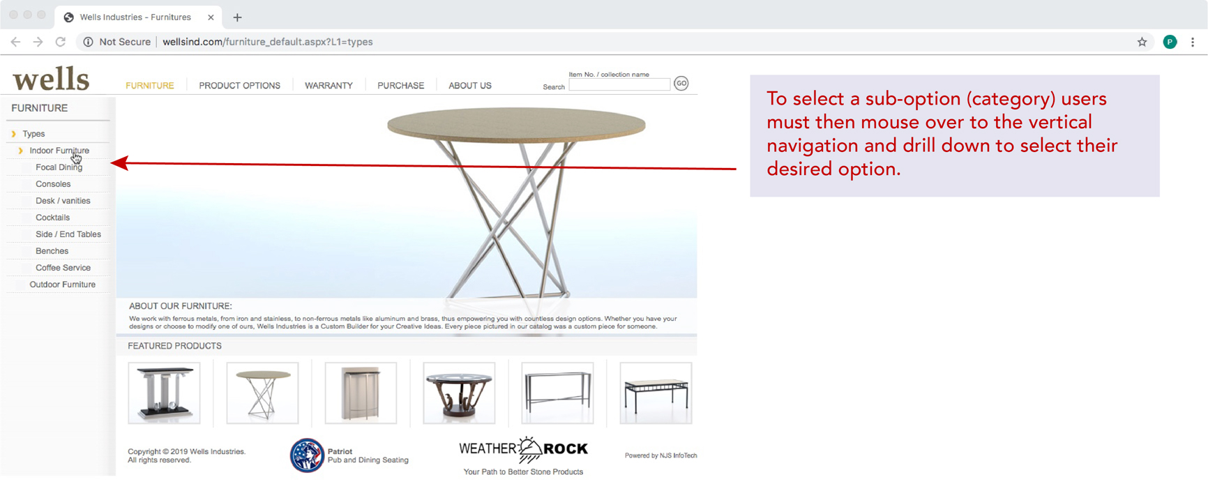
Figure 3 (top) and 4 (bottom).
Website navigation.
While the test users were used to this behavior from experience with the website, both reported that it was “a little annoying” to have to go back and forth. The interface requires that they move their mouse to two different locations to use the menu system. This is very inefficient creates extra effort on the part of the user and goes against modern design patterns for usability.
When browsing a category page, the display of images is much too small. Both users mentioned their dissatisfaction with such small images. Hovering over the images, which usually shows a much larger view of the item, only displays a very slightly larger view of the product, See Figure 5. The only way to see a larger view is to click on the product and go to the product detail page. The product detail page itself is also problematic, as discovered during user testing and the Walkthrough. This will be addressed as Problem 3 (below).

Figure 5.
Typical product category page.
Lastly, User 2, mentioned that she frequently put herself in the shoes of a new visitor to the website and was not familiar with the company, and thought it might be helpful if the home page had, at or near the top of the page, a brief blurb about the company to tell a visitor what the company does and to give some assurances that the company has some authority. The website does have an About Us link in the horizontal menu, but it is very unhelpful and says nothing about the company itself, for example where they are located or how long they have been in business. As User 2 said, "I’d rather not have to go to the About US link to find something about the company."
Problem 1— Solution
In this case a design refresh is suggested. Modern websites should use HTML 5, CSS 3, and Javascript to display slide shows or carousels. Frameworks such as Bootstrap can be easily incorporated into the code to provide this built-in feature. Because there is so much unused space available, some marketing content can then be incorporated. A “Jumbotron-like” feature can be added at the top of the home page to effectively communicate the metal-working expertise of the company as well as add a compelling call to action to invite the viewer to review their products. Keyword rich content will also help internet searches and SEO. The navigation structure can be brought up to modern standards with a slight re-design. Product images can be made larger to showcase Wells’ modern design aesthetic, perhaps incorporating a “Quick View” link which will open an overlay with a larger view of the product. Finally, incorporating a modern, mobile responsive design will help mobile users as well as improve page ranking.
Problem 2— Search and Filtering
Both users suggested a need for filtering the products and a more comprehensive search. The website currently has no filtering options and the search function is rudimentary at best and only works when entering a product number or “collection name”, see Figure 6. The search is so limited that User 1 does not find it useful at all, and User 2 only uses it to find a specific product by Item number as specified by the designer. Entering a collection name is inconsistent. For example, the product category Focal Dining under Indoor Furniture produces no results, but searching for Consoles— the next category under Indoor Furniture— does. Both users want the ability to search for “brass and glass” or “tables with marble tops,” for example.
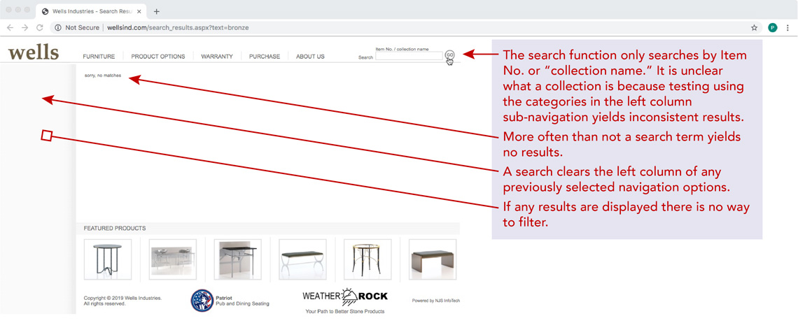
Figure 6.
Search and filtering
Additionally, One cannot search by the industry standard terms such as “End Tables,” one must select it from the drill down menu and click Side / End Tables. Both Users 1 and 2 wanted the ability to search by dimensions as they often have very limited available space in a room. Frequently the designer needs to filter for material or finish options to maintain design consistency in the room.
Entering text in the search field and clicking the circular GO button either displays the results or, more frequently, “sorry, no matches.” Either result clears the sub-category menu from the left side column, forcing the user to repeat the procedure and re-click to drill down to find a product category to look through.
Problem 2— Solution
With the a redesign of the site, eliminating the secondary left-side sub-navigation, room opens up for filters in the narrow left column. A combination of radio and check-boxes will give the user the ability to filter search results or narrow all the products displayed on the category page. The addition of keyword rich product descriptions or a list of tags associated with a product should help with the search function. For interest, a visual heat map might also be incorporated into the design with each data term clickable to help the user narrow down the options and find exactly what they are looking for.
Problem 3— Product Detail Page
Because Wells Industries is exclusively for the design trade, they do not need a shopping cart, per se. Products do, however, need to be displayed attractively and product specifications especially need to be readily available. All furniture can be customized, with a wide variety of materials and color options for the tops and finishes for the metal bases available. Purchase quantities may range anywhere from one for a home to potentially hundreds of pieces for a hotel. As such, designers must request a quote based on a product’s materials, finishes, and quantity. Prices are not displayed on a product detail page but all other information should be.
Once the specifications are determined a “tear sheet” can be printed to paper or PDF and a price quote can be requested, either directly from Wells or through a Manufacturers Representative.
The current product detail page displays just an image of the product, along with the part number and a link for Product Information. There is no other useful information about the product, size being the most important as the products are highly customizable. User 1 commented that she would like to see a little more information such as the dimensions and a brief description of the product and the materials it is made from, at least for the standard configuration. There is also no breadcrumb trail to let the user know where they are in the category and product hierarchy. Both users commented on a cramped Featured Products display immediately under the product and both feel the space could be better used to show some additional information. See Figure 7. This clear anti-pattern is a departure from the standard product detail page found on almost any other e-commerce platform, a standard that users have come to expect.
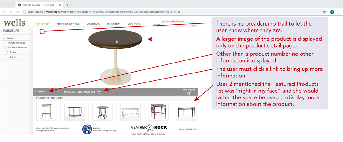
Figure 7.
Product detail page.
When the Product Information link is clicked a drawer overlay slides up, partially covering the image. The information shows only the product category, which as often as not doesn’t match the list of product categories displayed in the category list in the left column. Should a user continue browsing and later decide they liked a previous product best they often don’t know where it can be found and must hunt through all the products in all the appropriate categories to find it again. The only other information shown is a heading called “Features” which, while it does describe the purpose of the product doesn’t seem to match any of the product categories shown in the vertical navigation at left making it extremely difficult to find the product again. Shown along with Features are the product dimensions. This is further a wasted opportunity for SEO by utilizing keyword rich descriptions. There is also a cramped section that shows the ability to select the materials options for the top and the frame. See Figure 8. The term “ability” is used here as it is not a clear invitation with no obvious links or indication of how to proceed. Other than the words “Click here to change” there is nothing to differentiate this text from any other text to indicate is a button or link for bringing up the customization functionality.
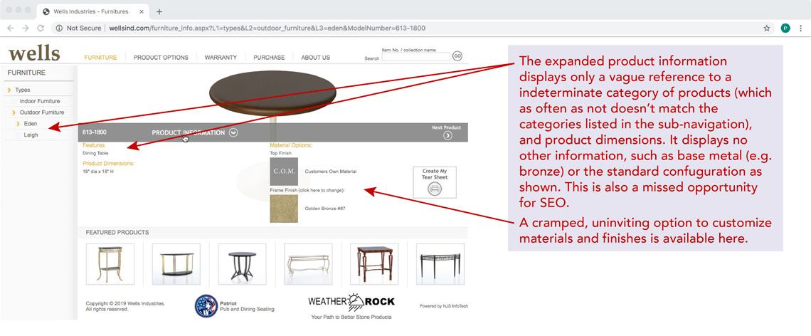
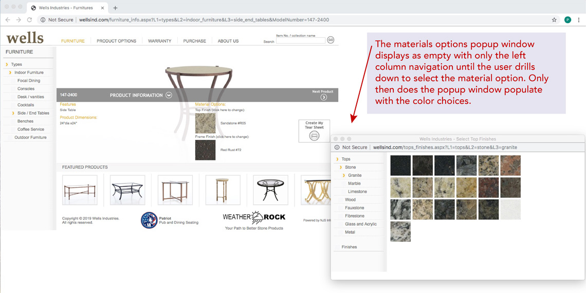
Figure 8 (top) and 9 (bottom).
Product detail page with expanded product information; and Materials options popup.
Both users commented negatively about the slide-up overlay covering the image and about information being incomplete. Clicking the materials options links brings up a popup page, echoing the design of the main page with a list of materials in a thin left-hand column and a big empty space in the middle. When a selection made by drilling down into a list of the available options, the available colors of that material are displayed in the middle. See Figure 9.
It is assumed the user knows that clicking the color swatch will then populate the material option, closing the popup window. In every test case clicking on the color swatch closed the popup window and while it populated the custom color swatch correctly the cursor became a “spinning beach ball” forcing the user to click somewhere in the window to to get it to become a regular cursor again. This interface anti-pattern forces the user to recall what to do, rather than giving them an obvious metaphor for recognizing what to do. Once the product specs have been determined the user can click on the “Create My Tear Sheet” icon to print, or they can request a quote.
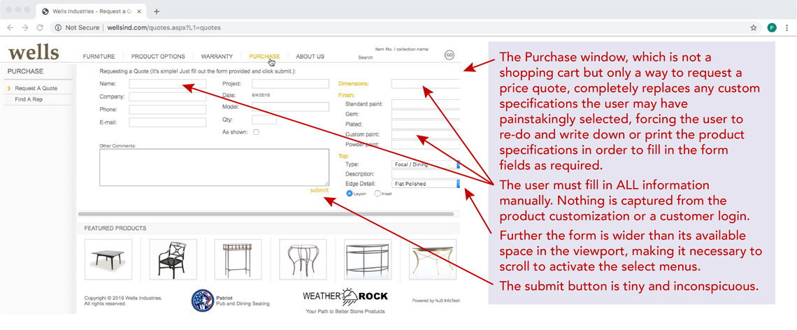
Figure 10.
"Purchase" page.
To request a “quote” the user has to click on the “Purchase” menu item, which brings up a form in the middle of the page, see Figure 10, completely replacing the product specifications. Unfortunately the user must learn the hard way to first have printed the tear sheet or written the information down elsewhere in advance because the form has replaced it. The form is wider than the available space and asks for information about the designer’s name, company, etc., the model number and dimensions, and other specifications. All of this must be manually filled in by the user.
Because both of the users were familiar with the website and exactly how to pick and specify a product in preparation for a quote, this task went easily, if not quickly because of all the unnecessary typing required. However, this author was confused and had to ask many questions about the process in order to form the necessary task models and Affinity Diagram. Further, the form itself required an understanding of terminology this author did not possess. The process for customizing and requesting a price quote is not intuitive.
Problem 3— Solution
A redesigned product detail page is required to bring it in to line with current user interface patterns and user expectations. The look and feel should be like any standard product detail page, with a large image to one side and complete details along with a keyword rich description. A clear invitation with a call to action for customizing the product should be shown as a possible “next step” along with a field for quantity. Finally, two CTA buttons will be displayed for the ability to print the tear sheet and request a quote. The quote form will then be displayed below the product detail using auto-fill capabilities to fill in as much information as can be captured from the product detail page’s custom selections. A competitor’s website does in fact capture the information from the customized spec sheet and uses it to auto-fill the quote request form.
There is no Login feature on the site. The benefit is that anyone can easily submit a quote request. The drawbacks, however, are that Wells can not vet in advance the person requesting the quote, which important because vetting would prevent the designer’s client from doing an end-run around the designer; nor is it possible to capture session data to help auto-fill the form. Additionally, registration will allow the user to opt in to receive email notifications and newsletters, which will aid in marketing and outreach.
Conclusion
The current website for Wells Industries presents a way for designers and furniture specifiers to customize a furniture option and request a price quote. The functionality of the site is simple with only two tasks and does not present a system complex space as both work domain complexity and interaction complexity are low. The website does present challenges from both a design and user interface perspective. It uses outdated technology to display a slide show of images on the home page and outdated web interface patterns making usability more difficult than it needs to be. Further, the website is not mobile friendly making it impossible to use on a small screen. Users also report for need for better search and filtering capabilities. The wellsind.com website is in need of a modern redesign for both aesthetics and functionality.
Here it must be noted that at the bottom of each page of the website are links to two other websites that are somehow associated with Wells Industries. One is a furniture manufacturer that explicitly mentions the Wells family in a single sentence on that website’s home page. The other site is for stone products and does not explicitly mention any association with the Wells family anywhere on the site. However, logos at the bottom of both these other sites link not only to each other but back to Wells Metal Furnishings (Wells Industries). A full analysis was not performed on either of these other sites, however, both do pass the Google mobile friendly test and both have a modern look and feel to them. It is recommended that the Wells Industries website be updated and a universal style sheet be developed for a consistent look and feel across all three websites to aid in company-wide branding.