
UX Case Study— Part 2, Redesign
OBJECTIVE:
To update the Wells Industries' web platform to better meet the user's needs
and promote a better user experience for their visitors and clients.
See Part I, Evaluation for the evaluation of the existing platform.
Introduction
Wells Industries is a custom manufacturer of metal furniture that sells “to the trade” meaning they do not sell directly to the consumer but to Interior Designers. Wells offers their clients the ability to completely customize their furniture selection. An evaluation of their existing site shows it to have a difficult and inefficient user interface, it uses out-of-date plugins, and the design is extremly out of touch with modern trends, diluting it's brand presence in a market that is very much style conscious.
Objectives
The goal is to find the best solutions to improve the user interface and overall user experience:
- Give a modern and updated look and feel to the website to increase brand recognition and SEO opportunities;
- Provide better accessibility through improved navigation;
- Refine the product detail page so that visitors can find the information they require easily and efficiently;
- Improve the product customization function and the associated quote request form;
- Update the search function for better effectivness;
- Create a user login and account section which will help to vet potential customers, provide a better user experience for submitting forms, and provide additional outreah opportunities.
Website Challenges
In Part I, Evaluation user testing and a contextual inquiry was performed. This involved finding test users and giving them specific tasks to perform on the website. Because the website has only one purpose, a single work task was assigned: Find any coffee table, customize it, and get a price quote. The time to perform the task was recorded. The users were asked to think aloud so the observer could take notes. Users were also asked questions about what they were thinking and why they were performing the actions they did. This resulted in raw user data that could then be analyzed to determine the best course of action.
Additionally, a Cognitive Walkthrough was performed to detect any additional problems with the website and this analysis was compared to the results of the user testing to confirm commonalities as well as discover any additional issues not found during user testing.
Phase 1— Analysis
After the data has been gathered analysis begins by gathering statements made by the users into individual work activity notes. These individual notes are then placed and eventually notes with similar topics begin to be clustered. From these clusters characteristics begin to emerge and relationships can be established. For the Wells website a Work Activity Affinity Diagram was produced, see Figure 1. The affinity diagram was used to identify connections in the data, create hierarchies, and identify what factors to focus on that will support the most successful design possible from the user's perspective.
The analysis found that problems clustered broadly into three main groups:
- Interface Design and Information Architecture;
- Search and Filtering;
- The Product Detail Page which includes the interface itself as well as the Product Customization function and the Quote Request Form function.
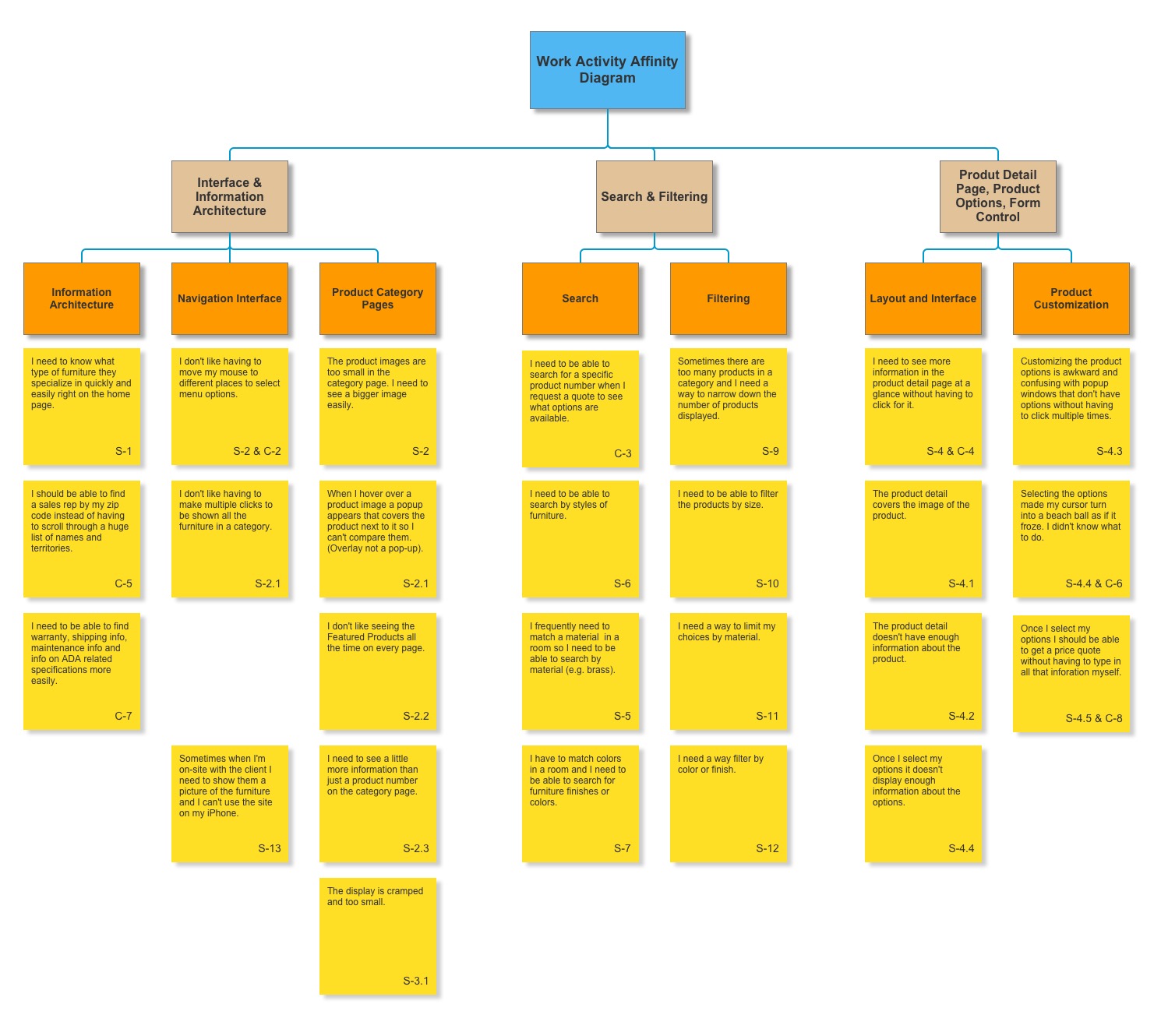
Phase 1.
Work Activity Affinity Diagram.
At this point requirements extraction can begin, and by this we mean interface design requirements, not software or system specifications at this stage. Requirements statements are deduced from the Affinity Diagram notes and from these requirements statements a task structure model can be developed. In the case of the Wells Industry website a simple Hierarchical Task Inventory was produced to model the tasks and subtasks the user performs while performing their work practices, see Figure 2.
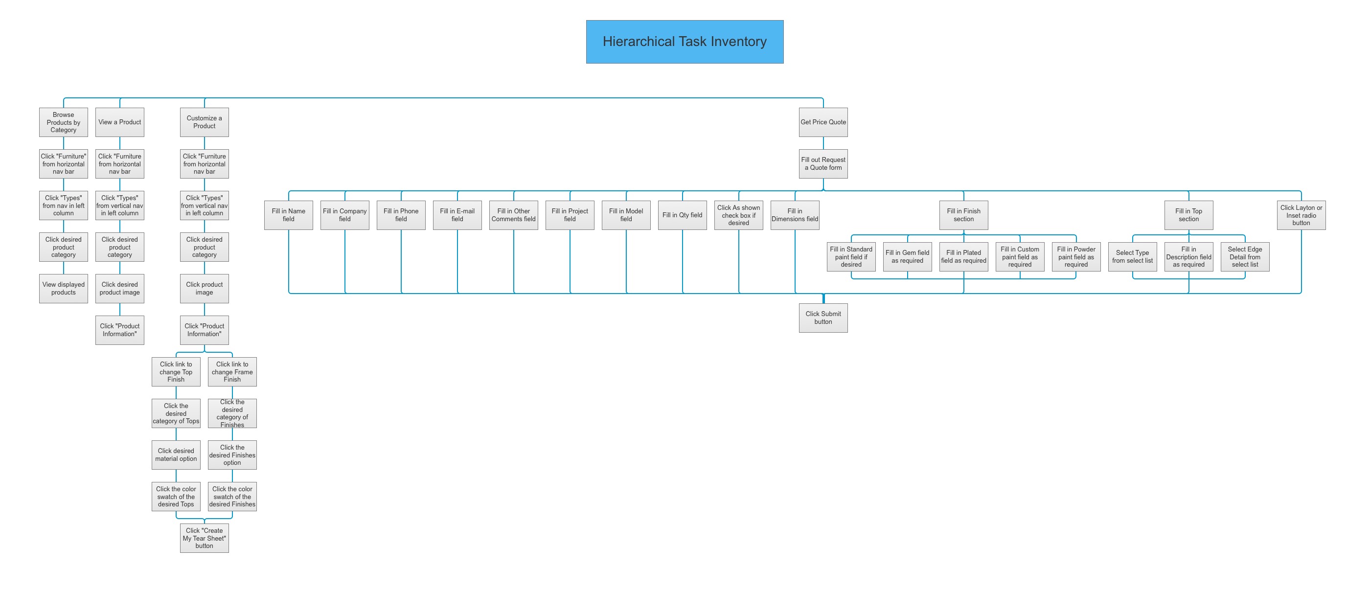
Phase 1.
Hierarchical Task Inventory.
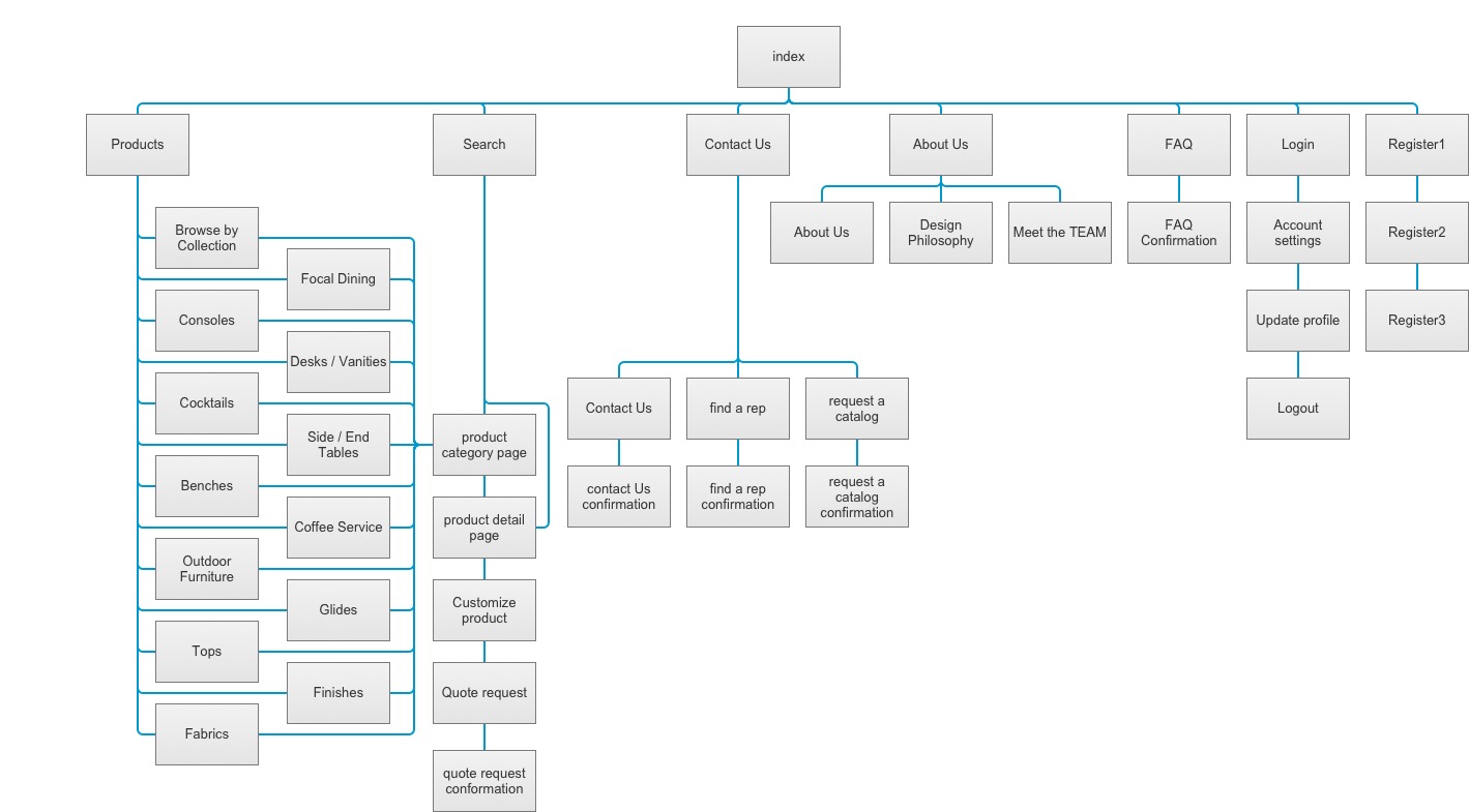
Phase 2.
Site structure.
Phase 2— Site Structure
Refining the information architecture for this website is vital to the redesign as the navigation on the existing site was determined to be inefficient for users. A site map was created that parallels the HTI and which details the entire site structure, including all necessary tasks and navigation, see Figure 3. The site structure helps to:
- Visualize how many clicks it takes a user to get from point A to point B;
- Show visually if any information is burried to deeply in the site structure and hard to access. A normal rule of thumb is that the user should be able to find what she is looking for within three clicks;
- Ensure the users task work flow is efficient and correct;
- Refine the conceptual model before the site is built, while changes are easy, and makes the building process more efficient.
Phase 3— Wireframe
Once user needs and requirements are understood and the site structure and task flow have been determined, design thinking and ideation can begin. While tempting to jump right in and start coding, taking the time to develop good conceptual models is essential. Creating quick skepches on paper is excellent for exploring alternatives, and finding the best solution at this stage is much better than the expensive process of rewriting code later.
The sketches helped to develop the mental model and a wireframe was created, see Figure 4. Axure RP was used to block out a layout for the primary pages. The user interface and design was refined over a few iterations with feedback. The goal was to make finding products, and the information about them easy along with creating an intuitive customization process and painless procedure for submitting a quote request. A good experience makes for a happy client, which in turn may lead to a sales opportunity.
- Spend some time early to create the necessary mental models, taking the user needs into account;
- Make quick sketches on paper to explore as many alternatives as possible with this inexpensive method;
- Create a low fidelity wireframe of the necessary pages and refine it through several iterations;
- Inexpensive prototypes created at this stage will reduce the need for expensive code revisions later.
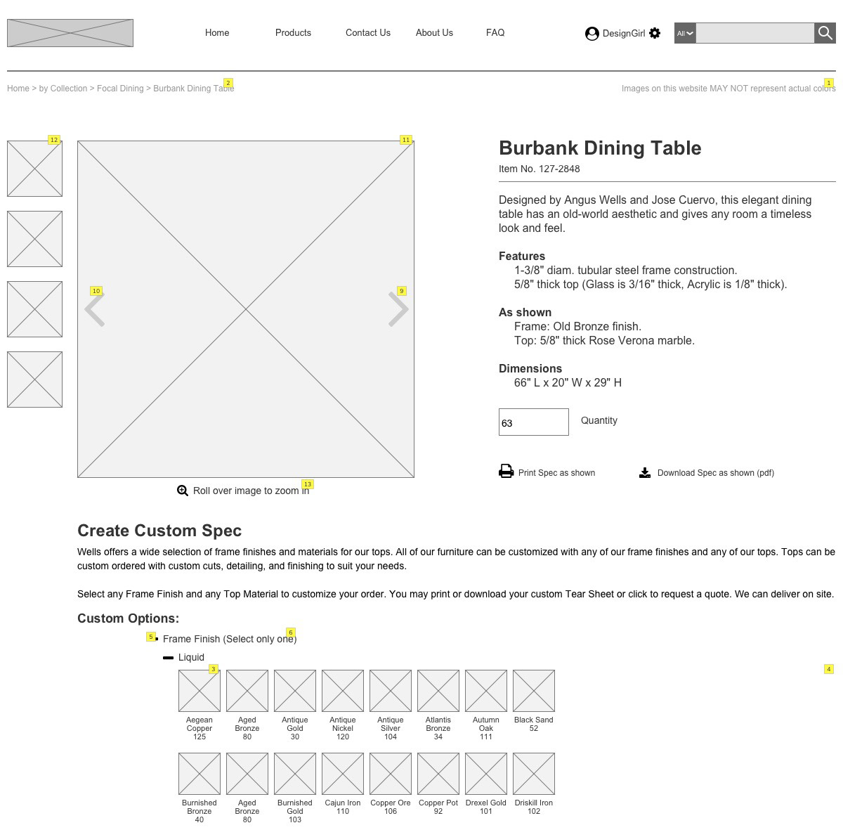
Phase 4.
Wells wireframe prototype.
Phase 5.
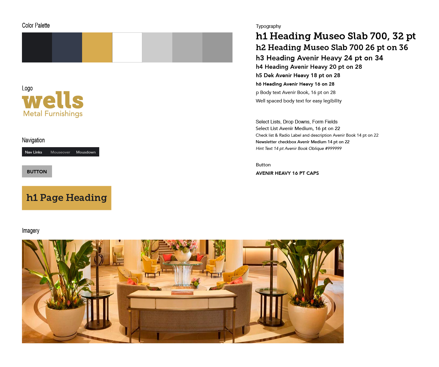
Wells Style Guide.
Phase 4— Style Guide
The original website was bland and lacked personality. However, the Wells family has been working with metal for 140 years and it was necessary to convey that proud family tradition and solid history.
In place of the bland palette, a new color palette was introduced. Blue was used to convey a sense of stability, trust, security, and confidence. The secondary color gold was chosen to indicate wealth and elegance. For branding gold is often used for architecture, and blues— especially dark blues— are used for corporations where strength and reliabiliy are important. In this case the colors were toned down a little to give the site a stylish and modern feel.
Similarly, the typeography was updated, with Avenir used extensively for its clean look. Paired with Museo Slab for contrasting headlines, Museo Slab is modern and has "presence" but with a friendly and warm appearance.
The logo was updated slightly befitting a modern and stylish, yet classic and strong, sensibility.
Imagery is meant to highlight their products. The addition of banner images will showcase the products in a stylish and beautiful setting. Product images will be high quality and optimized— in contrast to the low quality images used in the existing site.
Phase 5— Interactive Prototype
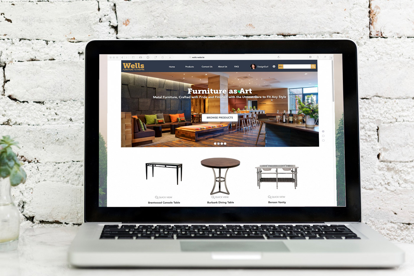
The new website gives Wells a modern and approachable look. The updated brand will highlight their furniture and tell a story of tradition and excellence. Equally important, a new user interface with improved navigation and functionality will heighten the user experience, giving their clients greater confidence in the Wells brand. The improved Quote Request Form, contact forms, and call-to-actions were developed for easier conversions; What was once a cumberson process is now a streamlined and easy experience for their current and potential clients.
This prototype was created in Axure RP 8 and brings together the lessons learned in the case study as well as the insights gathered during the interaction design phases.
- A Work Activity Affinity Diagram (WAAD) was created to identify paint points and areas of focus;
- A Heirarchical Task Inventory was produced to model the tasks and subtasks;
- A site structure was created and from this a wireframe was produced;
- User testing and evaluation determined where the models needed rework in an iterative process;
- Design elements were introducted and an interactive prototype was created.
Phase 6.
Wells Industries redesigned website interactive prototype.